Connect is a web based platform that empowers people to safely engage with others through thoughtfully curated, in-person neighborhood events designed to bring people together and uplift the community.
Role
Timeline
Team
Course
Project Overview
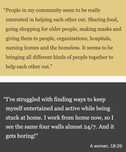
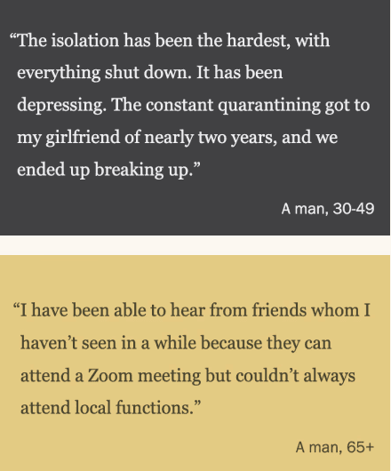
For this project, we were tasked with selecting participant quotes from a PEW Research Study to inform our design of a web/mobile based interactive interface that will offer opportunities for improving the personal lives of those affected by the pandemic.
As a team, we noticed that isolation, mental health and lack of connection were recurring themes in this study and decided to build a web platform to facilitate community connection through local activities in the specific fields of art, gardening and mental health.
Outcome
Connect is a web platform designed to foster community growth. It aims to address the social challenges and restrictions brought on by the COVID-19 pandemic in 2020 by helping people discover and register for COVID-conscious, in-person events within their neighborhoods, with a focus on community/neighbourhood engagement.
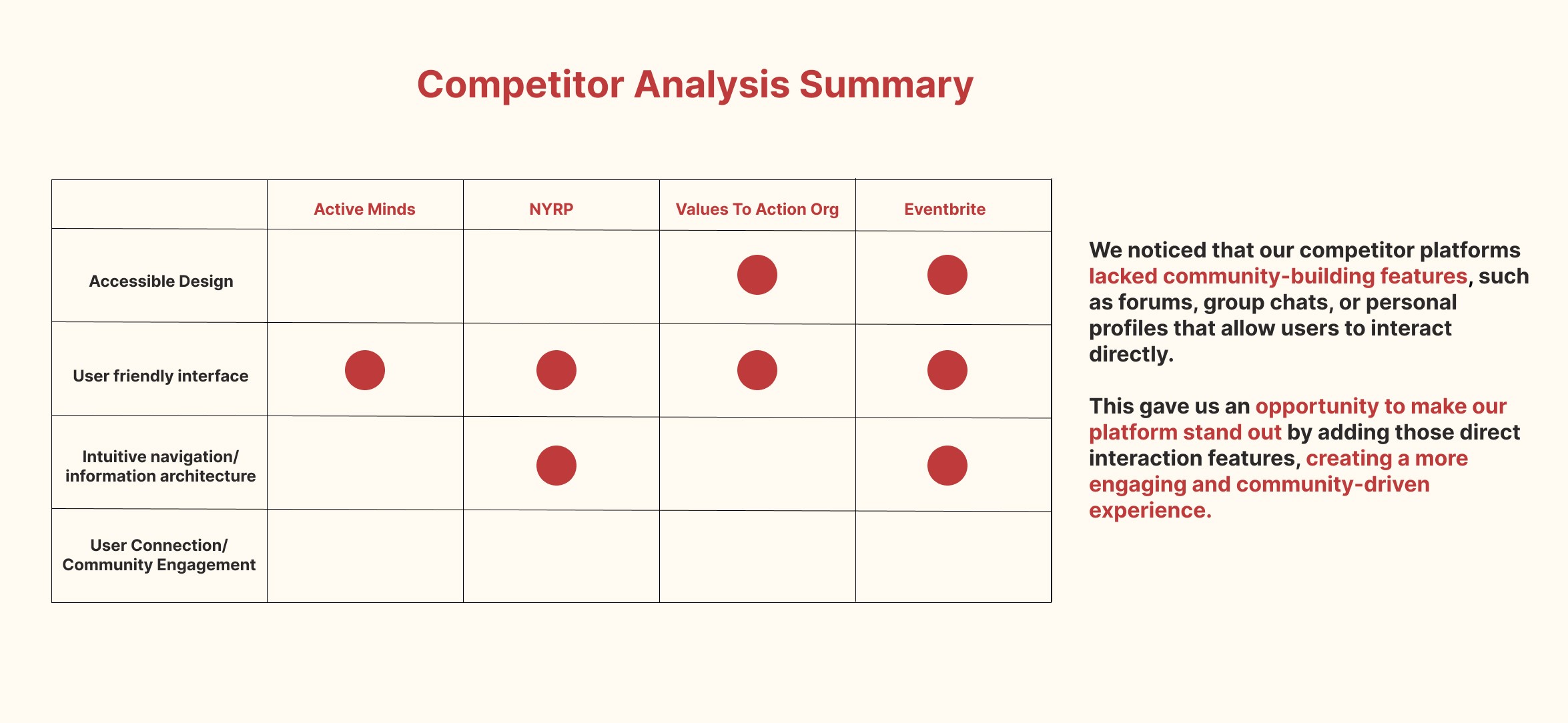
Research & Analysis
The design process started with reading the PEW Research Study and selecting quotes that spoke to us. These were some of the quotes we gathered to direct the project, and from here the theme of facilitating connection became clear.
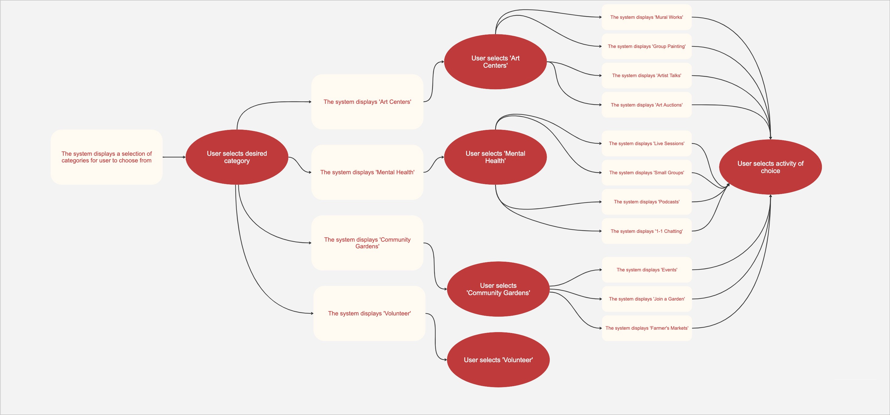
Connection via neighbourhood/localised activities was too broad an idea, so we narrowed down the target users to ages 21-45 based on the demographic information reported in the study, and the activities on the platform into 3 main categories, each overseen by one team member - community gardening, community art centers and mental health support groups.
Development / Ideation Phase
Our research gave us a clearer understanding of the problem space and user needs and we transitioned into the development and ideation phase. We focused on defining the core experiences of our platform by creating user personas, information architecture & user journey maps, and task flows.
INFORMATION ARCHITECTURE
TASK FLOW DIAGRAMS

Low-Fidelity Wireframes
Next we translated our ideas into low-fidelity wireframes. These wireframes served as the foundation for assessing basic functionality, layout, and user flow.
To ensure a collaborative design process, our team contributed individual wireframes for each section. Though each team member worked separately on creating different layouts, as a team we created a cohesive system by evaluating features and elements in our initial layouts, combining the elements we felt worked best, and deciding what the final layout for pages would look like. By sharing and refining our wireframes, we were able to align on key features and usability improvements early in the design process.
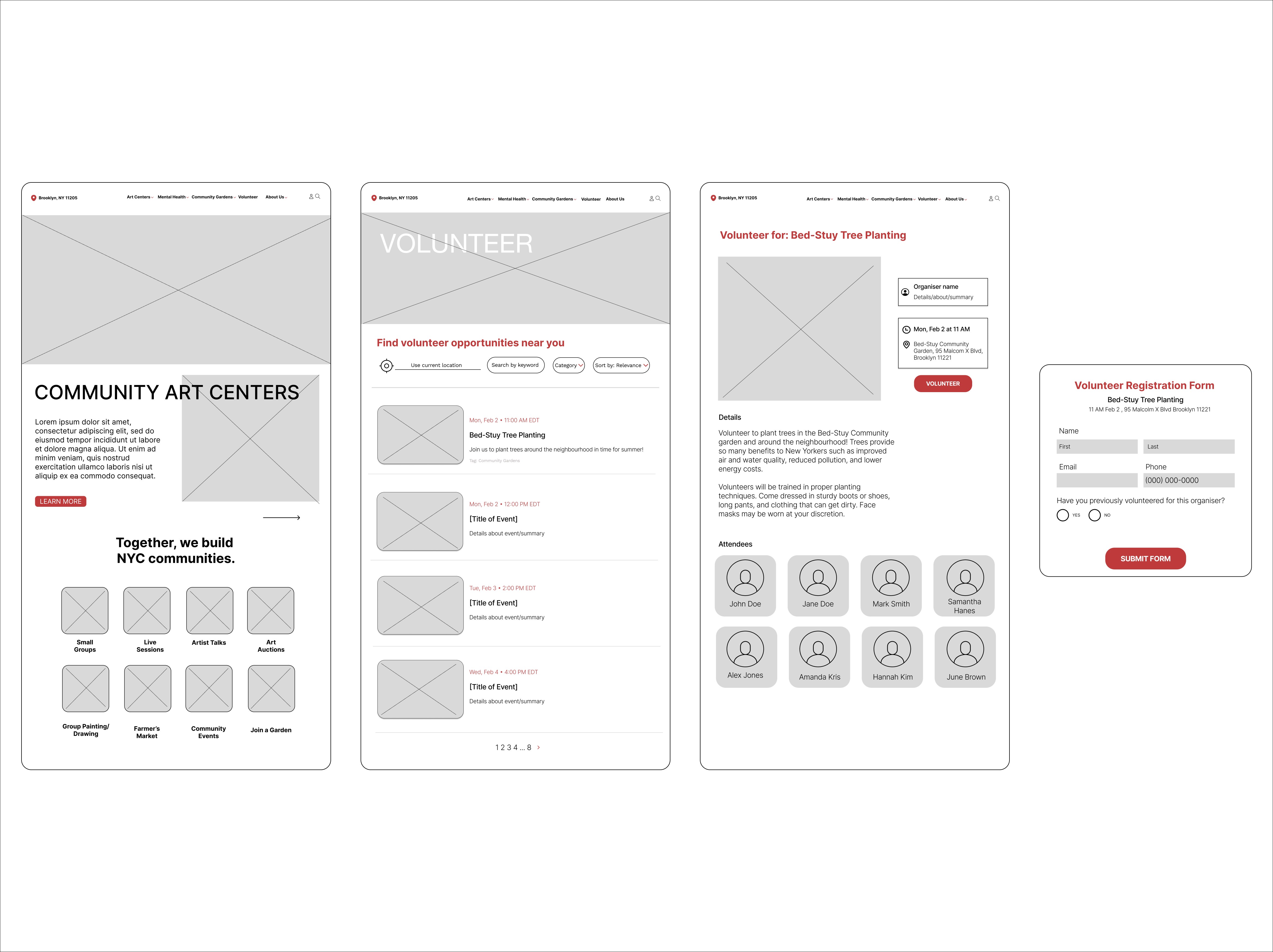
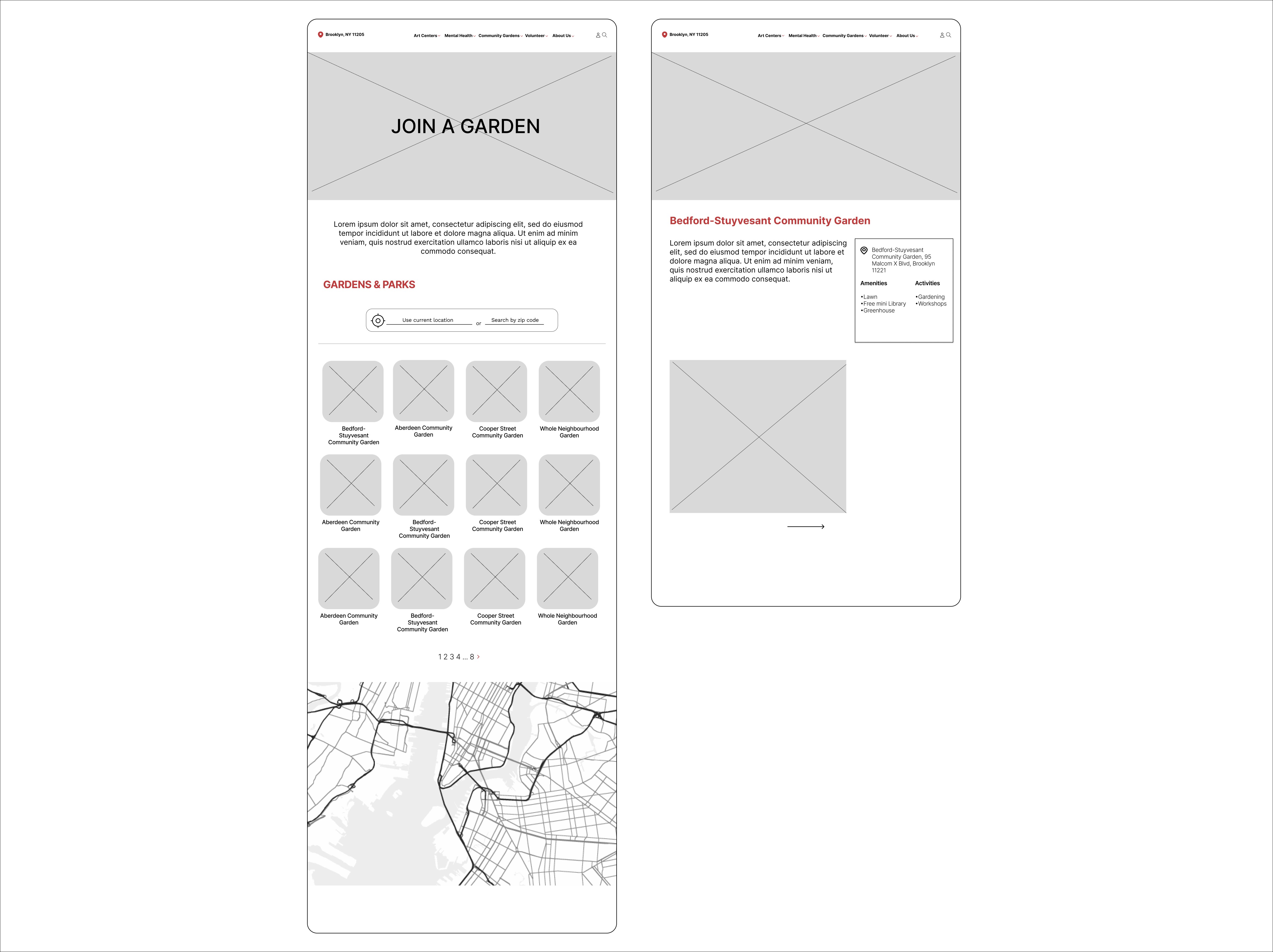
These are the low fidelity wireframes I created for the ‘Community Gardens’ & ‘Volunteer’ sections.
With a clear vision of how we wanted the website to function, we created a visual idenity for the platform and used this to design a working prototype in figma for user testing sessions.
User Testing Insights
The user testing sessions highlighted some counterintuitive design elements and accessibility issues.
Users appreciated the overall design, layout and registration process, but faced challenges with hierarchy, buttons and navigation, particularly in locating specific events and interacting with non-functional elements in the prototype.
To address these issues, we improved navigation flow, adjusted hierarchy & typography for better readability, and fixed the prototype functionality.
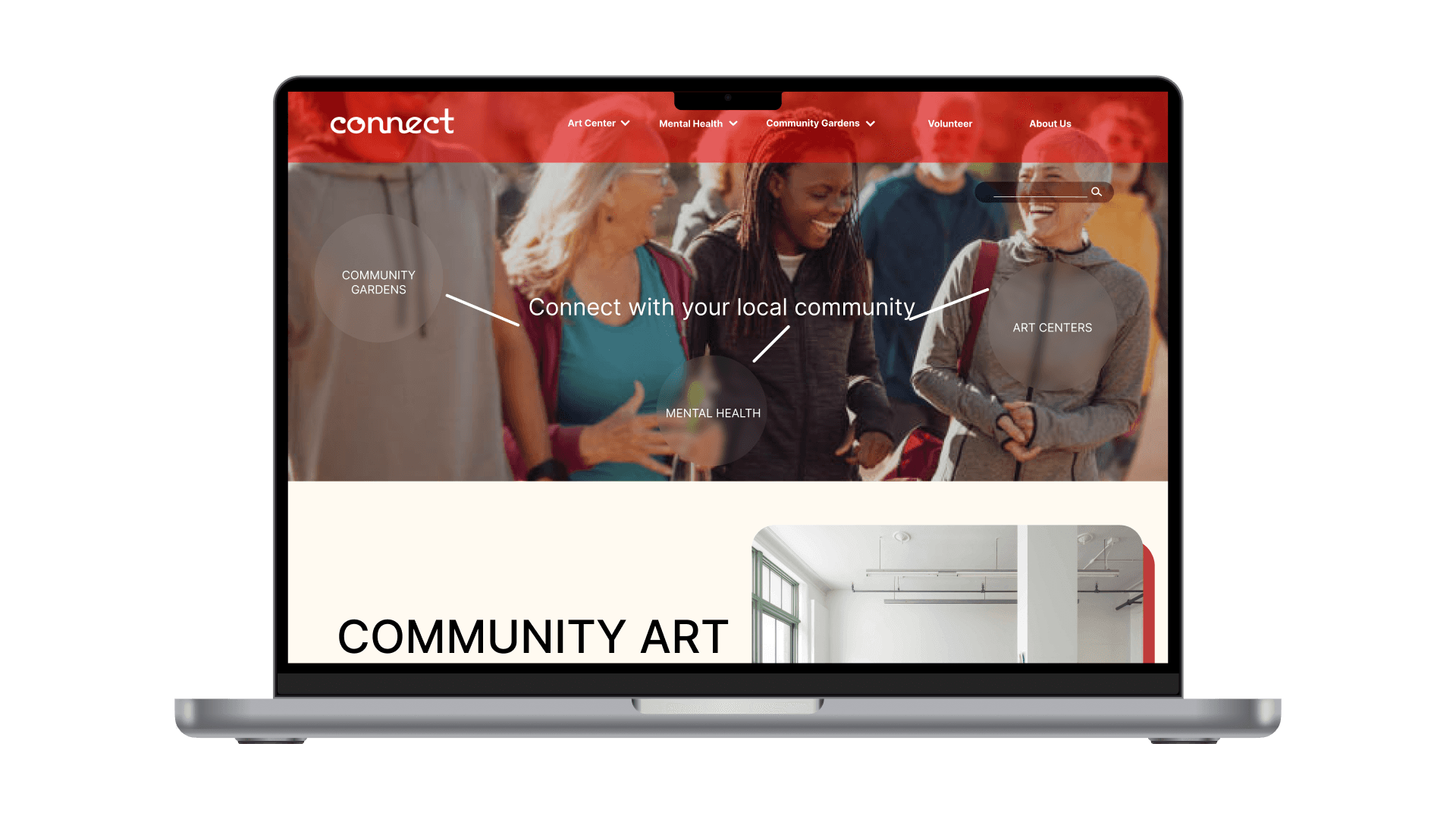
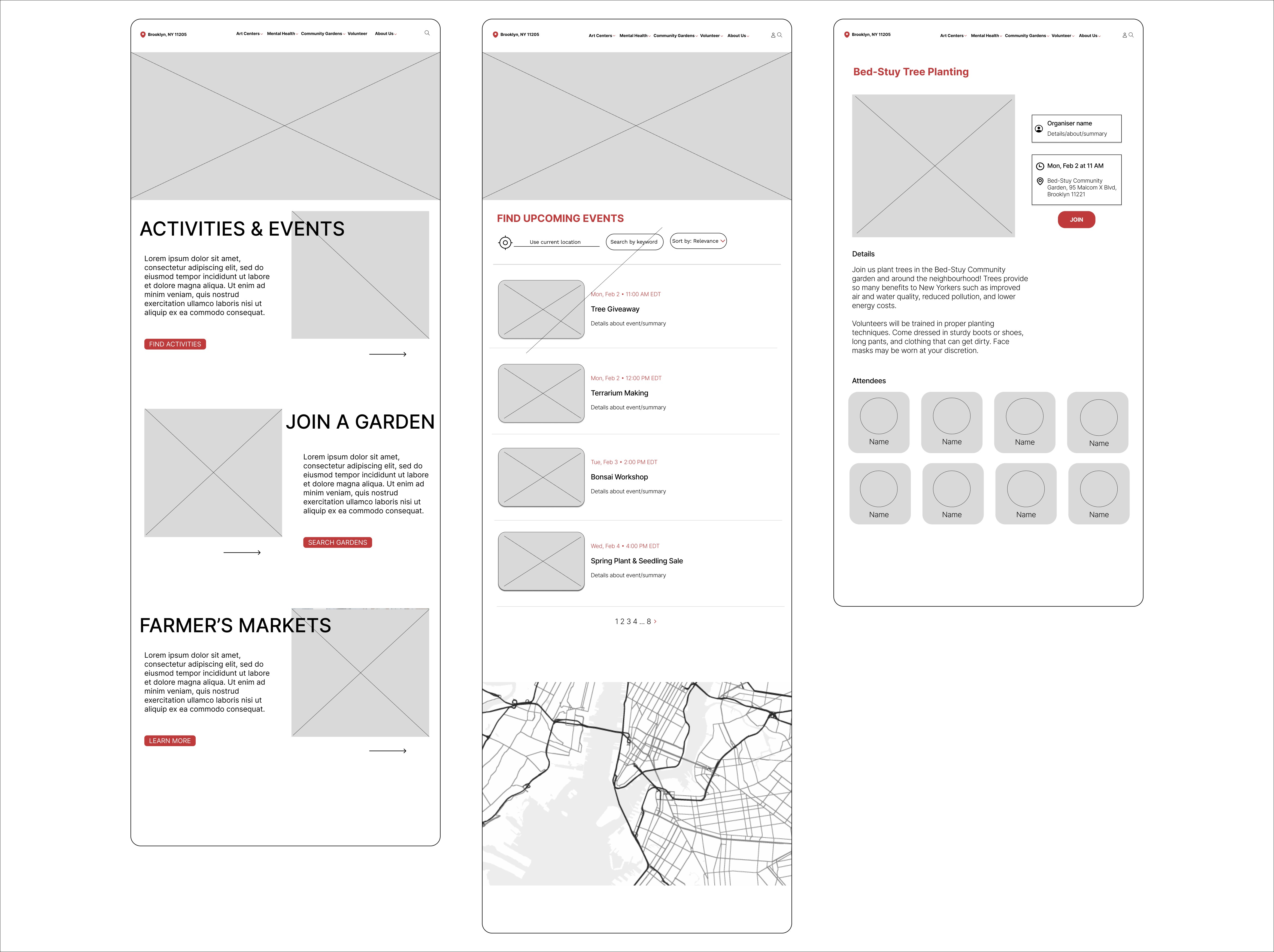
Final Prototype
Our final high-fidelity prototype brings together all the feedback and refinements from the user testing sessions. Each team member continued in developing their specific section, with mine being the Community Gardens & Volunteer pages below.
(View the interactive prototype by pressing the full screen button on the top right corner)
Reflections
This project gave me insights into user behavior, carrying out user research, crafting cohesive digital experiences and collaborative design work, as it was the first time I worked on a design project with a team. The first few weeks involved a lot of compromise and (necessary) conflict in working styles, aesthetic choices and communication, but by the latter phase of the project we were able to come to a consensus and work in sync with one another.
If I were able to do this project over from the start, I would conduct more research, particularly preliminary user interviews to get a sense of how users engage with existing competitor platforms, and more user testing sessions.
Aside from the fact that the research activities were my favorite part of working on this project, while designing the wireframes and final prototype it was apparent to the team that the user experience of the website would have benefited from a more research-focused design.